“I know this is hard to see in the back.”
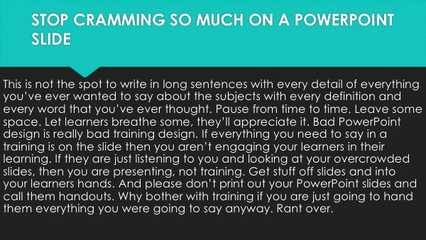
How many times have you heard those words as you watch a slideshow crammed with so many words, you could barely read them from the front of the room. Government codes, lengthy definitions, examples of forms and documents. You know the culprits.
Funny thing is…if the learner can’t see it, they aren’t going to get much value from it. And if every slide is crammed with stuff they can’t decipher, they are walking away with almost nothing.
PowerPoint sides are cheap. Having “too many slides” isn’t really a problem. What you do with those slides is the bigger issue.
How Many Words Are Too Many?
I’ve been around long enough to have lived through the Rule of 7×7 which morphed into the Rule of 6X6 which became the Rule of 4X4. Keep in mind, many of those rules are from a time when we printed each slide onto an overhead transparent. Printing was expensive. Slides were precious.
That time has gone.

Think about each of your slides from your learners’ perspective. What is the purpose of the slide? Does the slide help them to learn or retain a point?
Then just think fewer words, more slides. It will take some getting used to, but I trust you’ll get the hang of it!
Ditch The Bullet Points
If you’ve got 14 bullet points on a slide and you talk about every one of them, create 14 slides with one point on each.
Seems easy enough doesn’t it! Just because PowerPoint has a lot of bullet point slide templates available, don’t feel like you need to rely on them.
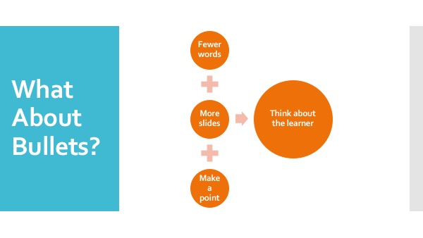
When there is a connection with your bullets create visual variety by using SmartArt to sexy up your bullet points. Let the relationship between your information drive the choice of your SmartArt.
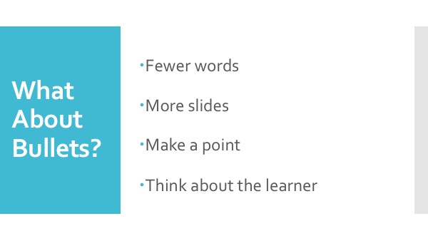
Start Here. It’s passible, but you can do more for the learner and for visual appeal.

Select your bullets and CONVERT TO SMART ART. Now the slide tells a visual story.

Your Art Is Hurting My Brain
PowerPoint has a lot of bells and whistles. It’s tempting for some people (we’ll blame it on new users) to use every animation and every transition and every photo and clip art imaginable.
Style people. Think about style.
One animation style.
One transition style.
One photo.

No clip art (unless it was created within the last two years, yes, say goodbye to string beans)
I could rant more, but I think you get the point.
No go forth and reduce the stuff you’ve crammed on your PowerPoint slides. Your learners will thank you.


[…] They were good. They were insights and perspectives I might have lectured on or explained through a boring bullet pointed list to explain. Almost as if by magic, I began to watch participants ideas and perspectives morph as […]
[…] pre-pandemic. Excessive bullet pointing is even more dangerous in the presence of a virus. PowerPoint isn’t the problem. It’s how you are using PowerPoint that is problematic. Use SmartArt to liven up boring […]